
Eduzone
Designing trust for a platform parents could believe in
To design visual communications that parents could trust — and a growing EdTech startup could stand behind.
Eduzone connects Nigerian children and diaspora families with vetted, expert tutors through a live, tech-backed platform. The product worked — one-on-one sessions, progress reports after every lesson, a tutor match guarantee. As the platform grew and Eduzone began showing up at events, across social feeds, and in the hands of parents, the opportunity was clear: visual communications that could carry the brand's credibility independently.
The CEO approached us with a specific brief: design that could communicate confidence. Not polished in a generic way, but rooted in Eduzone's brand — warm enough for a parent to feel heard, authoritative enough for them to believe. A startup entering a market where parents are protective of their children's time and money needs every touchpoint to do real work.
Our objective was to embed ourselves into Eduzone's visual identity and produce collateral that could carry the brand independently — at trade events, in PTA halls, on social feeds, and in the hands of parents considering a tutor for the first time.
Strategic Direction
Architecture before execution.
Before designing anything, we studied how Eduzone communicated: their signature green palette signaling growth and reliability, their tone balancing warmth with credibility, and the parents they were speaking to — people who don't just want a tutor, they want proof their child will be in safe, capable hands.
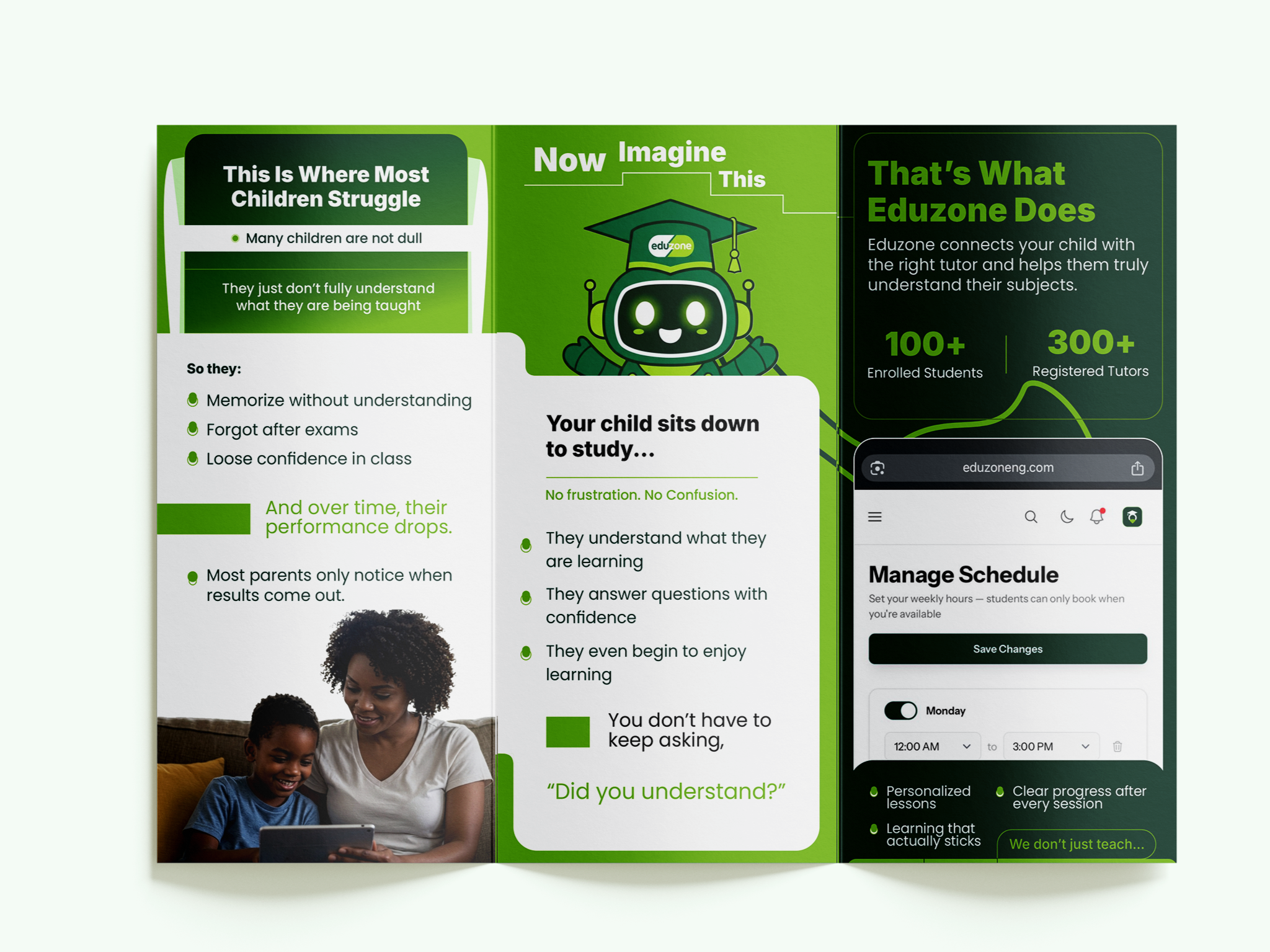
Every brief went through an architecture phase before any visual work began. The clearest example: when the CEO sent over six-plus pages of content for a trifold brochure, we didn't fill every panel. We analyzed the narrative arc, identified what parents needed to feel at each stage, and structured the six panels as a story — the child's struggle, an imagined alternative, the Eduzone solution. The result reads like a conversation, not a brochure.
The rollup banner followed the same logic. Designed to function as a standalone brand statement at events: emotional hook at the top, platform proof in the center, call to action at the bottom. The kind of piece that works in a room without anyone explaining it. It became Eduzone's official event banner, still in active use.
The six-piece ad flyer series was built as a cohesive campaign rather than individual one-offs — each piece carrying a distinct message (discovery, pricing, emotional investment, process, social proof, conversion) while sharing a unified visual language. A parent scrolling through their feed would encounter a consistent brand across every touchpoint, not a random mix of graphics.


Project Result
“This is too clean and beautiful. I love, love and love it. Graphase gives beautiful designs that sell my brand.”
Build Brands That Perform.
Build a brand that looks as good as it performs, commands attention and runs like a well-oiled machine.